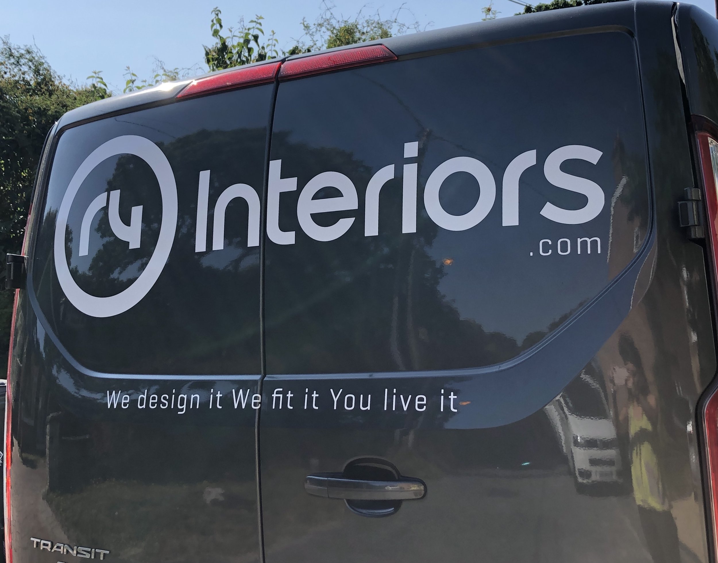
Interior Design

New Van Alert

NEW VAN ON THE ROAD

We have recently purchased another company van but this one is all signed and badged up!

Credit to StandOut Signs - link to their website at the bottom of the page, who put all of this together for us from the design to the install.

A very helpful and commendable local company who have the same design edge as us, not forgetting the speed at which they complete it - WE LOVE IT!

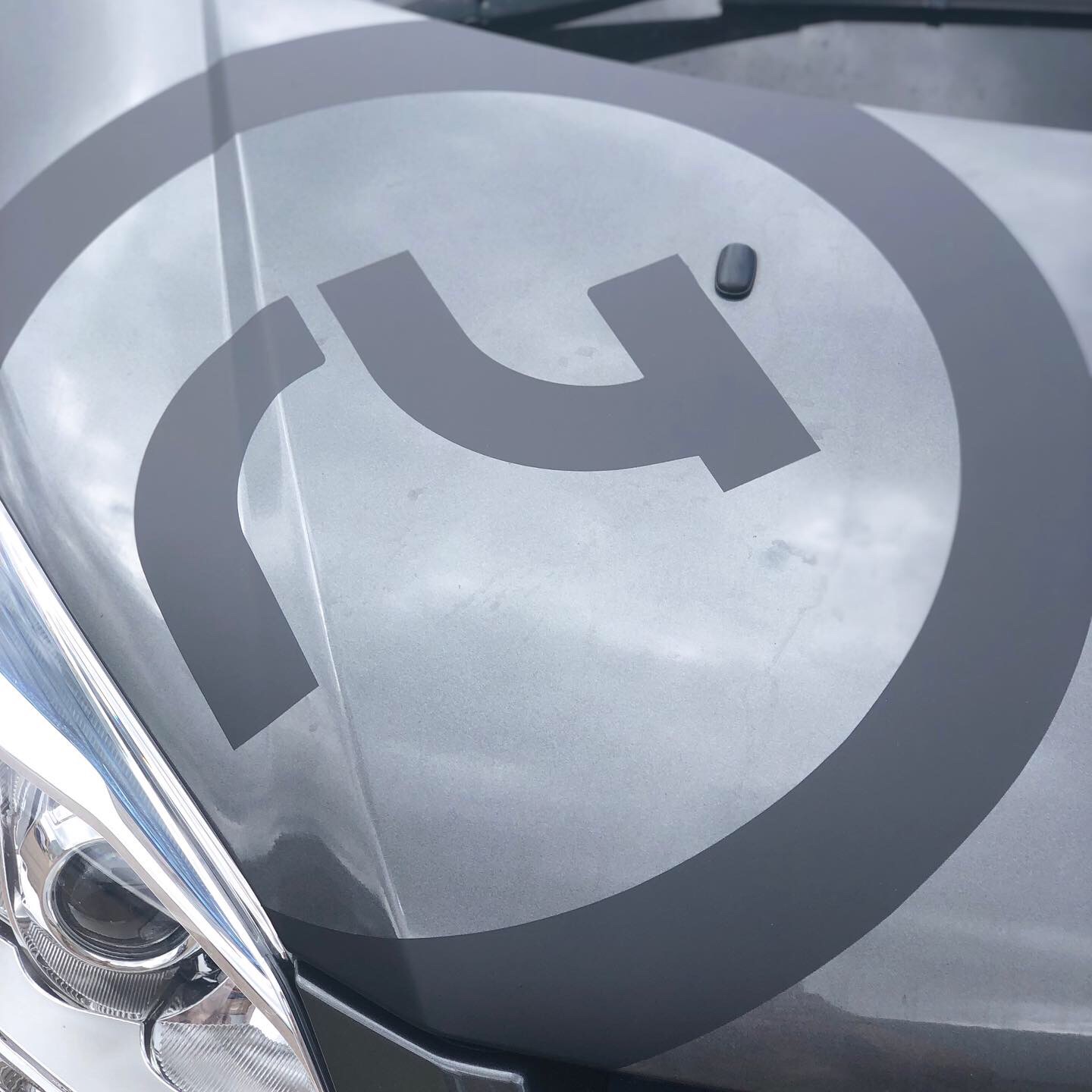
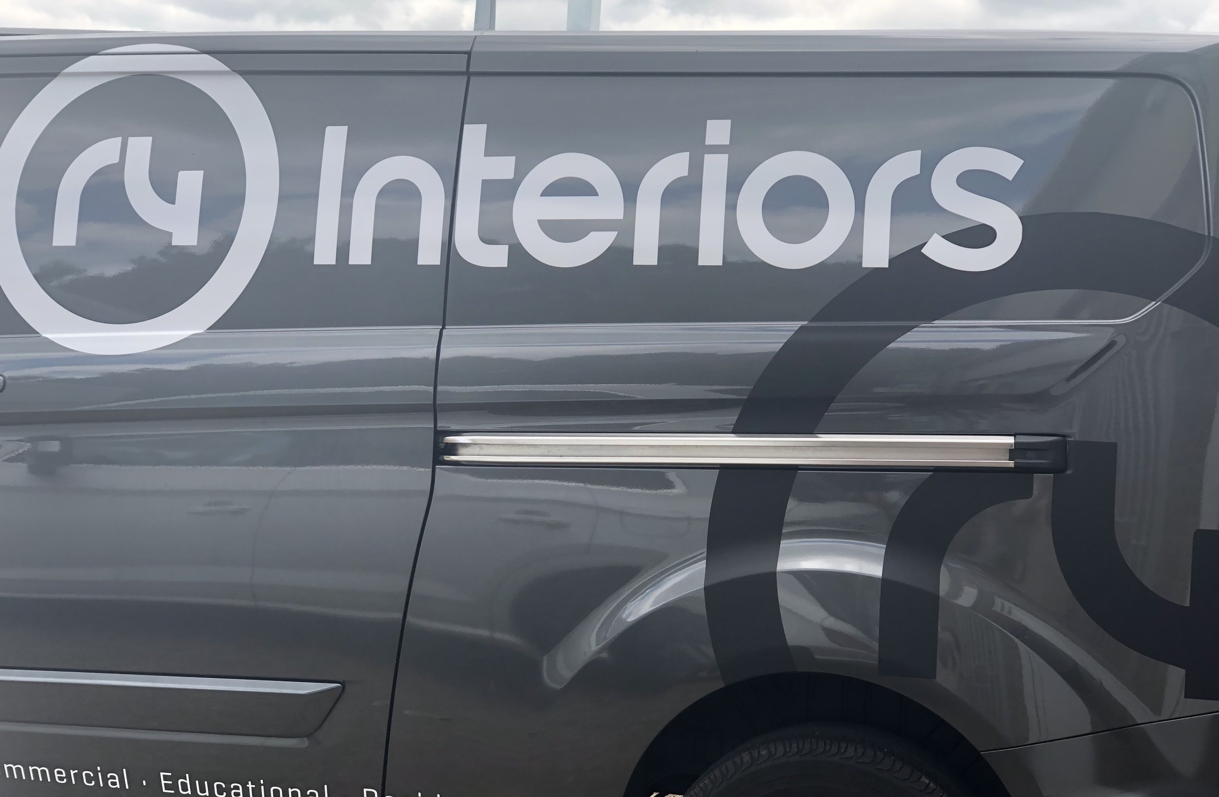
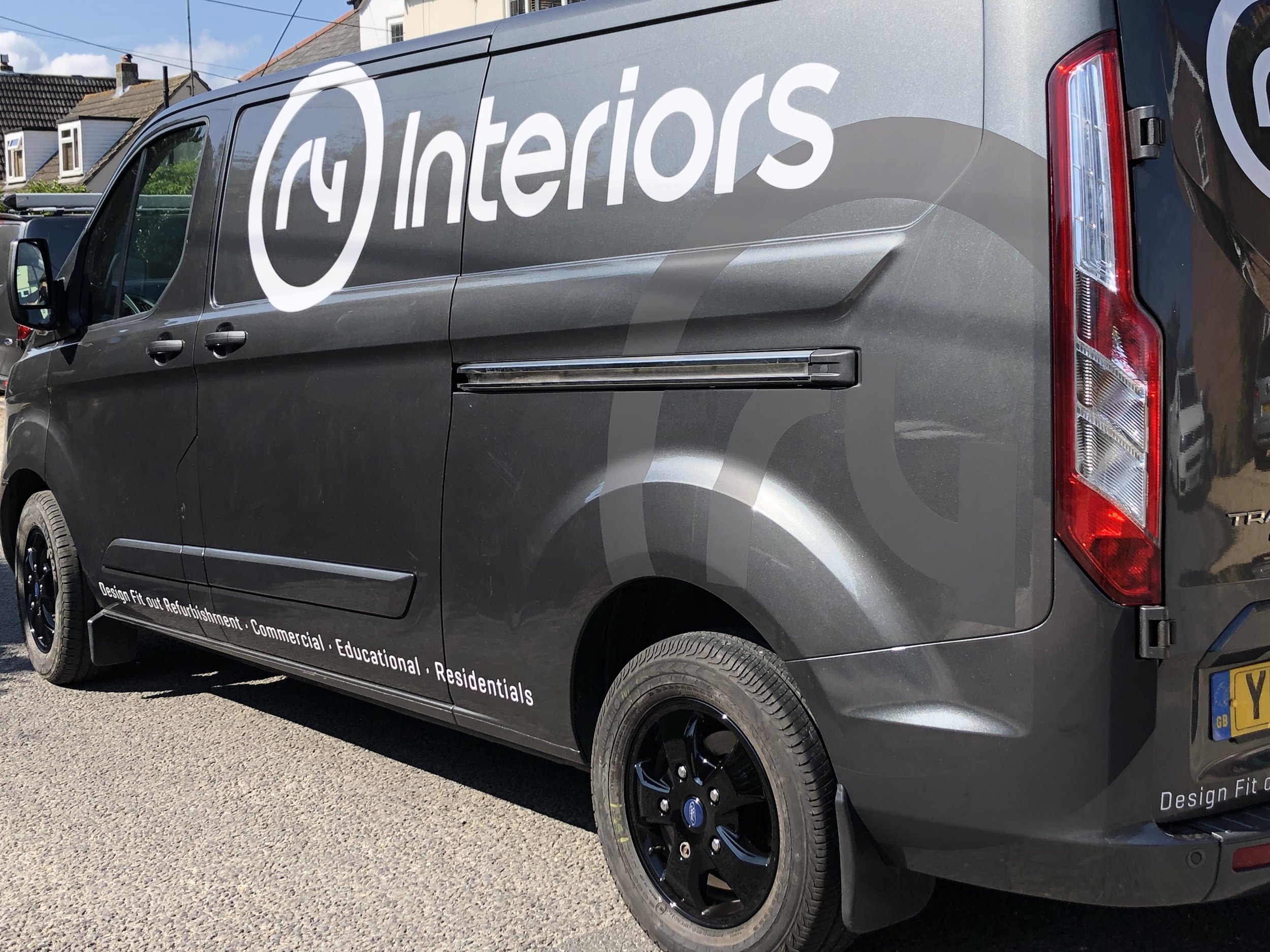
We are of course working up and down the country, forever on motorway’s, so if you do happen to see us give us a wave!

We Design It We Fit It You Live It

https://www.standoutsigns.co.uk/ located in our home town Poole

Beauty Salon Design and Refurbishment

Reju-u.

Reju-u contacted us to design their new salon room for their new business venture - FACIAL TREATMENTS!

The Brief was to be calming, warm, minimalistic and homely.

Grey, white and wood was used throughout the room so that colour could be added. Bespoke cabinets were handmade and sprayed to Farrow and Ball Dimpse, with a white Corian worktop covering one side of the room.

Creating a ‘homely’ look so that the clients could relax completely was our focus. ‘ Relaxation is a key element of a facial treatment’ Reju-u. The facials rejuvenate and create healthy glowing skin - we wanted the room to reflect this.

An ornate mirror attached to the wall makes the room feel twice as big and bounces light from the nearly full height window, giving the therapist the maximum amount of natural light possible.

A cosy corner with an armchair, throw and frames on the wall for added comfort for the client and/or another guest.

Being asked to design a room in the beauty industry was an exciting concept that we had never done before, the finishing touches were so much different to that of an office, restuarant or classroom which we are used to. However we loved the challenge!

r4 and Reju-u are extremely happy with the results and the clients love it!

www.reju-u.com

Restaurant Extension: COMPLETE!

The Square.

We have completed the extension and fit-out!

The clients brief was to create a flow between the existing restaurant and the new extension and to facilitate a growing number of tenants who use the area.

We wanted to create a modern, fresh and slightly raw concept that also felt spacious and warm with the acoustics being just so and I believe we definitely achieved this!

The flooring - Aged Indian Apple, a strong favourite and a classic sweeps throughout the whole area. This was used in the existing restaurant and still looks as good as new so there was no question about changing the flooring we just extended it!

The refurbished area is large with high ceilings, a full glass front surround and busy at midday, so the acoustics were a big factor in the design. We have used acoustic noise absorbing Heartfelt Ceilings which are suspended from the ceiling, using the tones of the fabric to get lighter towards the glass thus making the room appear even bigger and lighter.

Minimal colours were used as we wanted to keep the design looking timeless and contemporary for years to come however also with a natural feel for the tenants to connect to the outside world even on the coldest of days.

We used raw materials throughout where possible with such an emphasis on the world and the products we all use, we are being plastic conscious and using recyled goods where possible.

20180822_094555.jpg
20180822_094557.jpg
20180822_094606.jpg

We love seeing our designs and fit-outs working for our clients and being used to it’s fullest potential.

The Square is already being used for multiple functions including their big monthly mingle, serving breakfasts and lunches - we’ll be popping in for sure!

Bring the Outside Inside: How to incorporate Pantone’s 2017 Colour of the Year into your interiors #Greenery

In our previous blog post we introduced Pantone's Colour of the Year for 2017 as greenery 15-0343. It's fresh, natural and epitomises nature. But how can you incorporate nature into your interiors? We've provided 5 ways to do just this!

pantone colour of the year 2017 greenery interiors interior design home ideas inspiration

1. HUES OF GREEN

Bring the outside inside by selecting shades of green for feature walls, whether it is nature-inspired wallpaper or luxurious paint, the shade of green could be light right through to bold. 

2. HOUSEPLANTS

This may seem obvious but look at how you display your houseplants. Create an indoor garden space with shelves packed with your favourite plants, find feature pots and planters that make a statement or simply opt for low maintenance succulents. Houseplants will make your living space more comfortable, natural and breathable. 

pantone colour of the year greenery in interiors bring the outside inside interior design ideas

3. NATURAL MATERIALS

Compliment greenery with natural materials; from bamboo blinds to contemporary eco-furniture. Exposed brick walls in their natural state make for great focal points and natural wood can be durable and adaptable to most spaces. 

bring the outside inside greenery nature natural interior design ideas

4. LIGHTING

Flood your home with natural light; it's not only an interior statement but also fosters a positive, healthy living environment. Don't obstruct sunlight with cluttered window decorations and utilise skylights where possible. 

5. VERTICAL GARDENS

Now this could well be a step too far for some but for others, it's the perfect opportunity to combine your green fingers and your interiors! Create your very own vertical garden with hanging planters, modular planting systems and climbing plants; it doesn't get much greener than this. 

Pantone’s 2017 Colour of the Year - Greenery 15-0343

Pantone recently announced their colour of the year for 2017 and we are delighted to hear that it is Spring shade Greenery 15-0343; a fresh and zesty green, it is nature's neutral.  

Pantone Colour of the Year 2017: Greenery 15-0343 via www.pantone.com

What does the shade Greenery symbolise? It's symbolic to new beginnings and our desire to seek solace in the natural world, away from the hustle and bustle of modern day life, where one can relax, breathe and take time out. 

Refreshing and revitalising, we often think of green hues as welcoming and relaxing, identifying it to health, wellbeing and nature. 

How can you incorporate Pantone's 2017 Colour of the Year into your interiors? Check out our next blog post where we'll explore bringing the outdoors inside with tips on adopting the shade Greenery.